Website redesign for a maternal health organization in Mumbai
My roles: UX designer (not visual), research lead, content strategist and writer, project manager, art director
*This is a project I worked on during my time at Studio Subu.
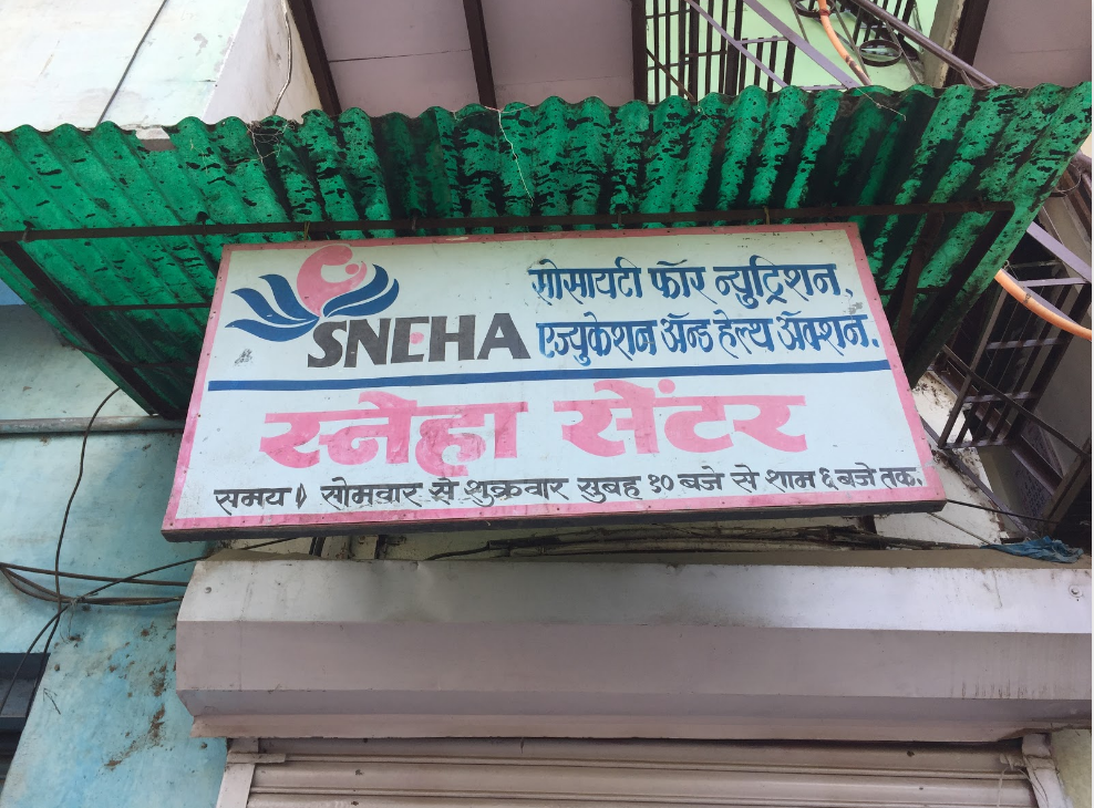
Society for Nutrition, Education, and Health Action (SNEHA) is a Mumbai-based organization that works on maternal/child health and domestic violence with communities, governments, and research partners.
Design challenge
How can we bring to life SNEHA’s work with women and children for a donor/partner audience?
1. Research
I began our project by creating a research plan to understand SNEHA’s organizational strategy, and how it needed to be translated for a donor/partner audience. Through interviews and field visits with SNEHA’s team, staff, and funders, I was able to better understand donor/partner requirements and uncover any other general communications challenges.
What we heard
- “As donors we really want to understand ROI. We want to see this particular project lead to this particular outcome.”
- “It’s difficult to find the right partners who are in it for the long term. We want to work with funders who can support us strategically.”
- “I’m experiencing difficulties in getting my staff to talk to potential partner NGOs about SNEHA in a compelling way.”
2. Key insights
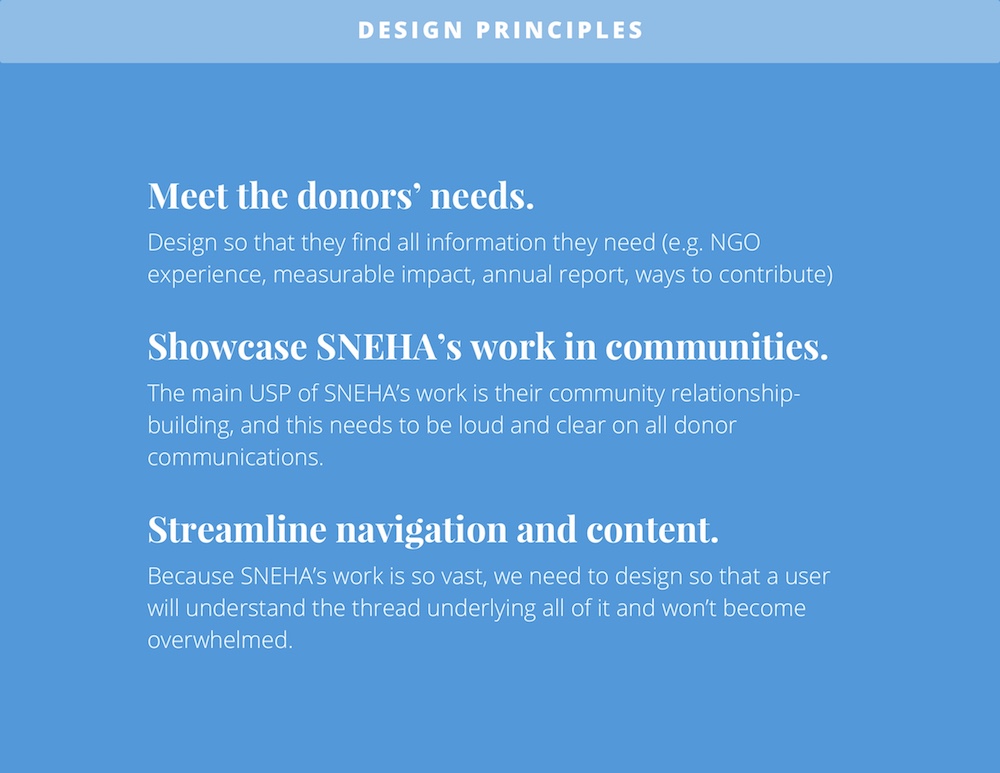
Our research showed that both individual and institutional donors and partners had very specific criteria they were looking for in NGO’s before engaging. At present, SNEHA was experiencing difficulties in communicating strategically to achieve its organizational goals.
I turned these insights into design principles that would guide our work.
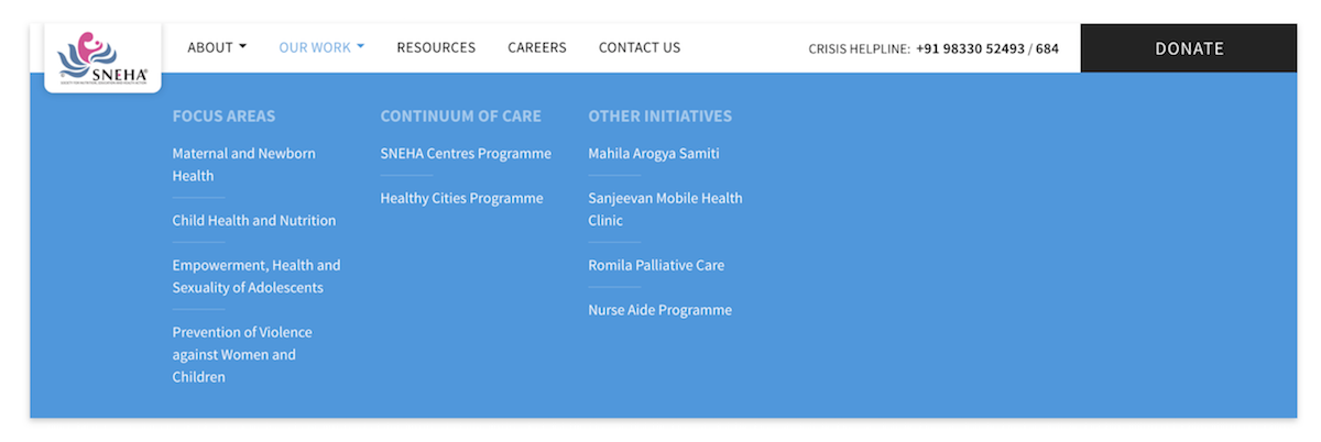
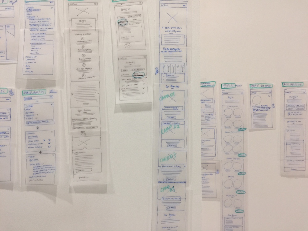
3. Navigation and content
One of the main challenges of this project was organizing all SNEHA’s information on an easily navigable site map. I worked with SNEHA’s Communications Director to categorize their work for easy understanding.
I also worked with her to completely overhaul the existing website content. This meant (pretty much) rewriting or editing content for each of the website’s ~25 pages. I aimed to craft content to build SNEHA’s credibility and establish an ambitious yet professional organizational tone.
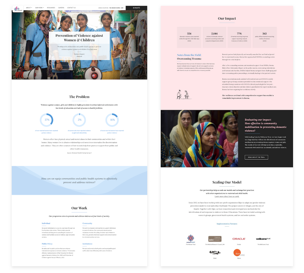
Zooming into the organization’s work pages — Design iteration 1
Working with content was a challenge simply because of its volume. How do we tell a brief yet comprehensive story around SNEHA’s work?
My first iteration below was designed to break up as much content as possible, to give viewers a quick glance of the page’s content. I considered using a side bar for easy navigation through the page.
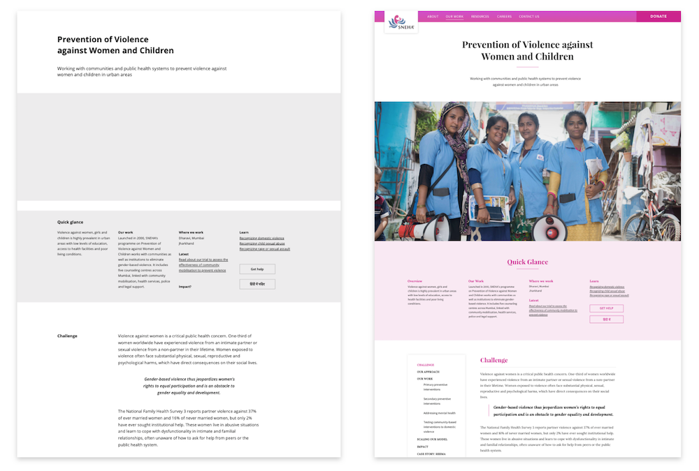
However, this design had a couple problems:
- We wanted readers to read through the actual content, and not just the quick glance.
- The content needed to be shortened significantly. The purpose of this website was not to give the full story of SNEHA, but only an initial impression that would lead potential donors and funders to inquire more.
Zooming into the organization’s work pages — Design iteration 2
My second iteration (final design below) dramatically reduced content so that a sidebar wouldn’t be necessary. This design tells a more concise story, and can also be replicated across many pages.
4. Mobile wire framing
Again, the sheer amount of content posed a challenge in SNEHA’s mobile responsive website. I prioritized specific components that had to be redesigned for the mobile version, and worked with our developer to implement them.
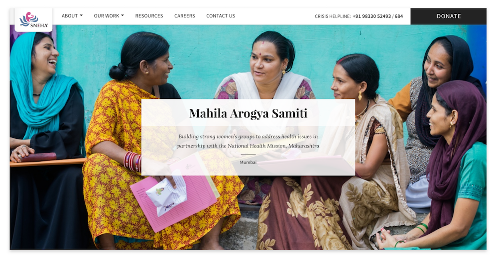
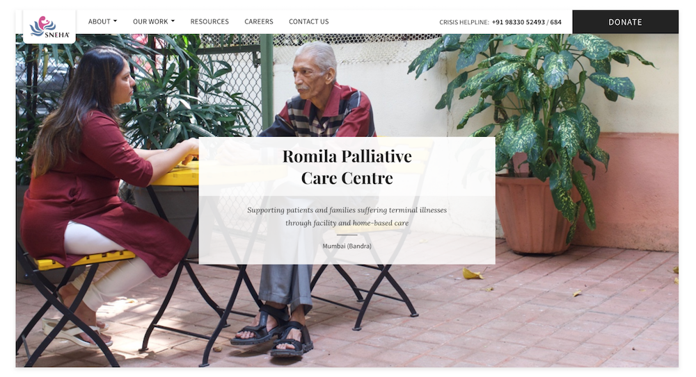
5. Photography
In my opinion, photography is an extremely important aspect to storytelling and creating an engaging experience. When done strategically, it can build credibility, trust, and interest. For this project, I organized and directed photo shoots in the field, and determined their content and placement.
Intended impact
SNEHA’s website launched in January 2018, to the our and the organization’s great excitement. Though it is still early to discern the site’s impact, we intend that it will:
- Increase SNEHA’s credibility and visibility to potential funders and partners
- Set an example of how to effectively communicate about development work
- Raise general awareness about maternal health and domestic violence in urban slums